
IT'S IN THE DETAILS
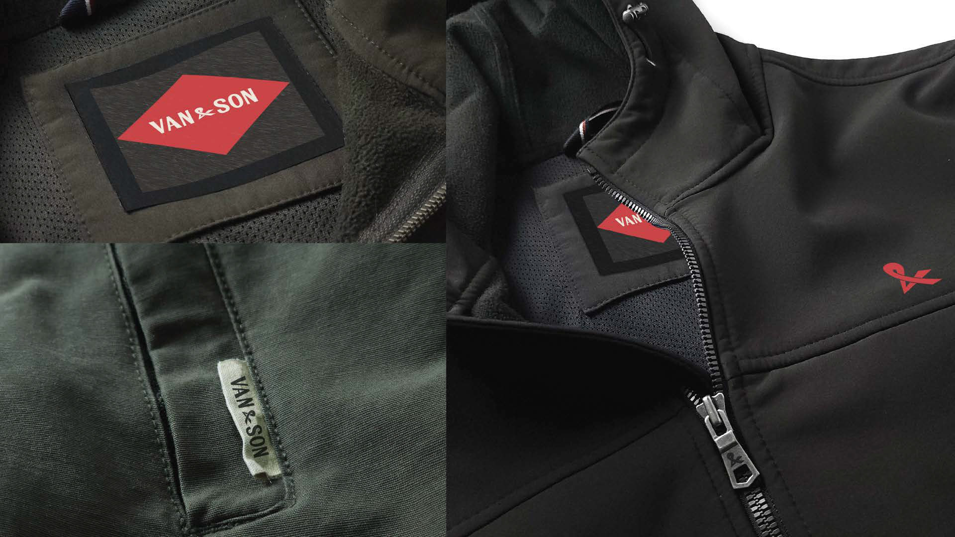
I photographed and edited all of these products to demonstrate where the brand’s marks will live — from the interior clothing label inside a jacket to the traditional left-chest placement, and even the finer details such as the zipper pull and side-seam tag. I wanted to showcase not only my editing abilities, but also my skill in capturing strong, intentional product photography.
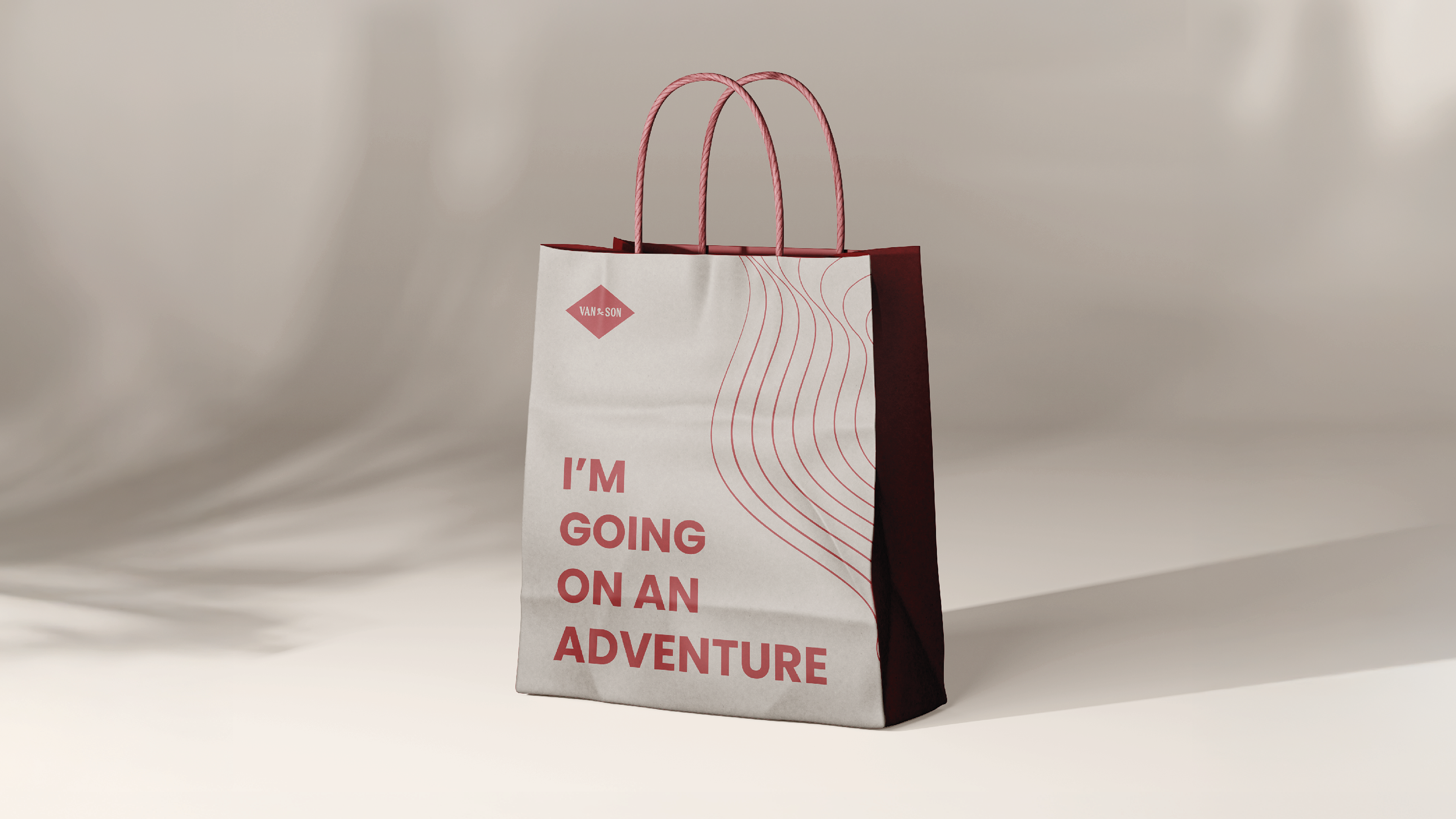
"I'M GOING ON AN ADVENTURE"
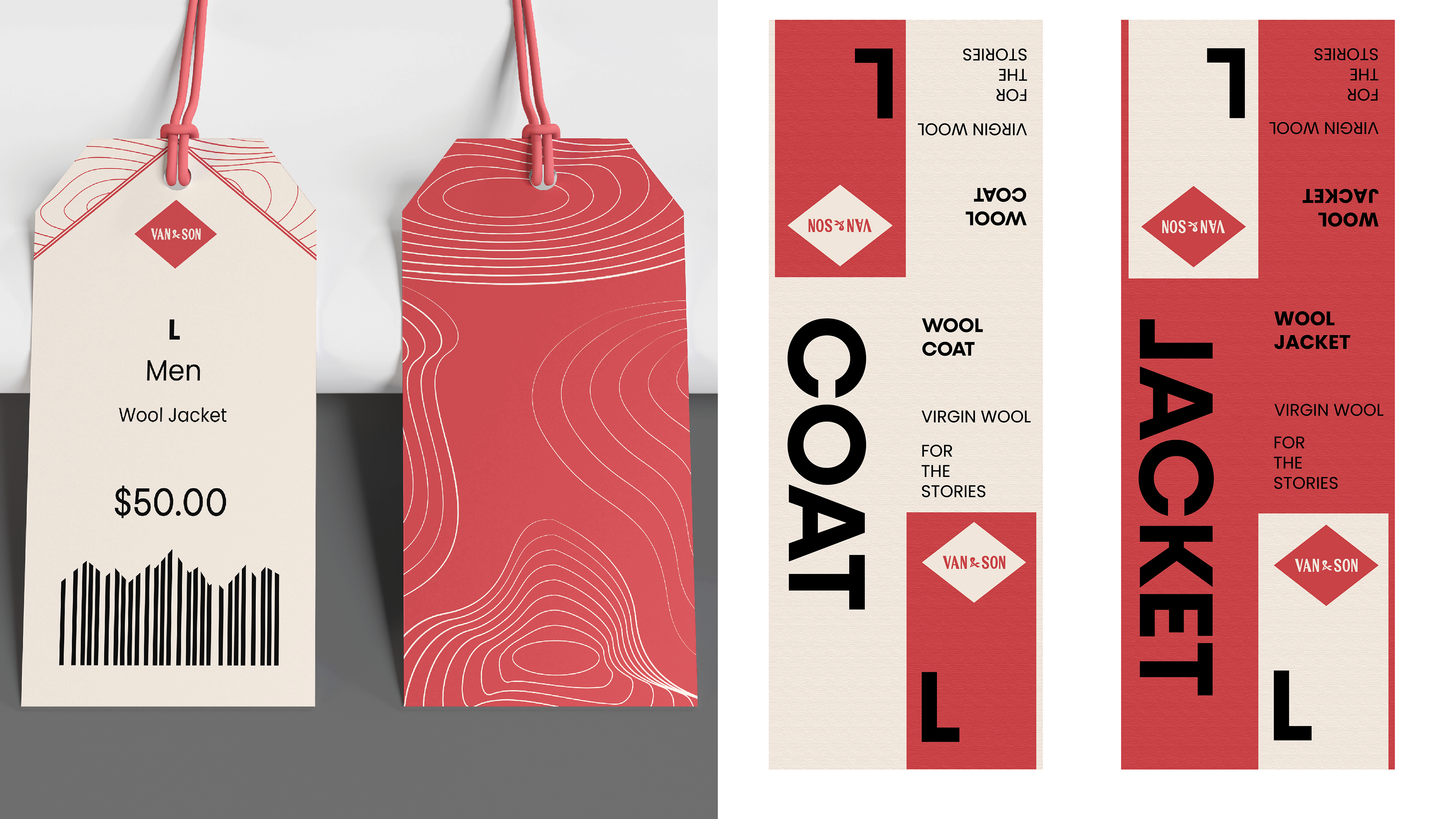
When creating my customer roadmap, I imagined the moment the customer walks back into the world carrying a bag that says, “I’m Going on an Adventure.” The message is meant to spark curiosity, giving the bag a voice and turning it into part of the story. In the end, the customer isn’t just buying an item — they’re preparing for the journey ahead.
PROJECT DESCRIPTION
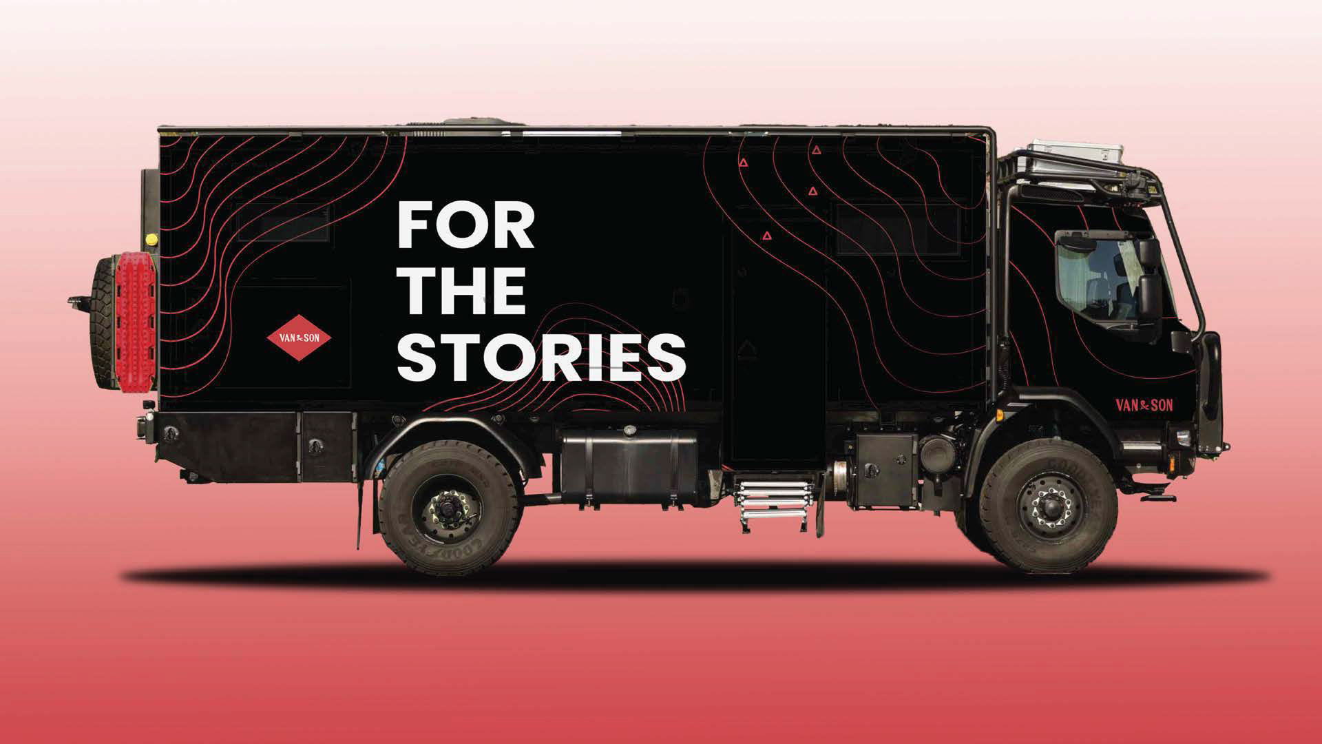
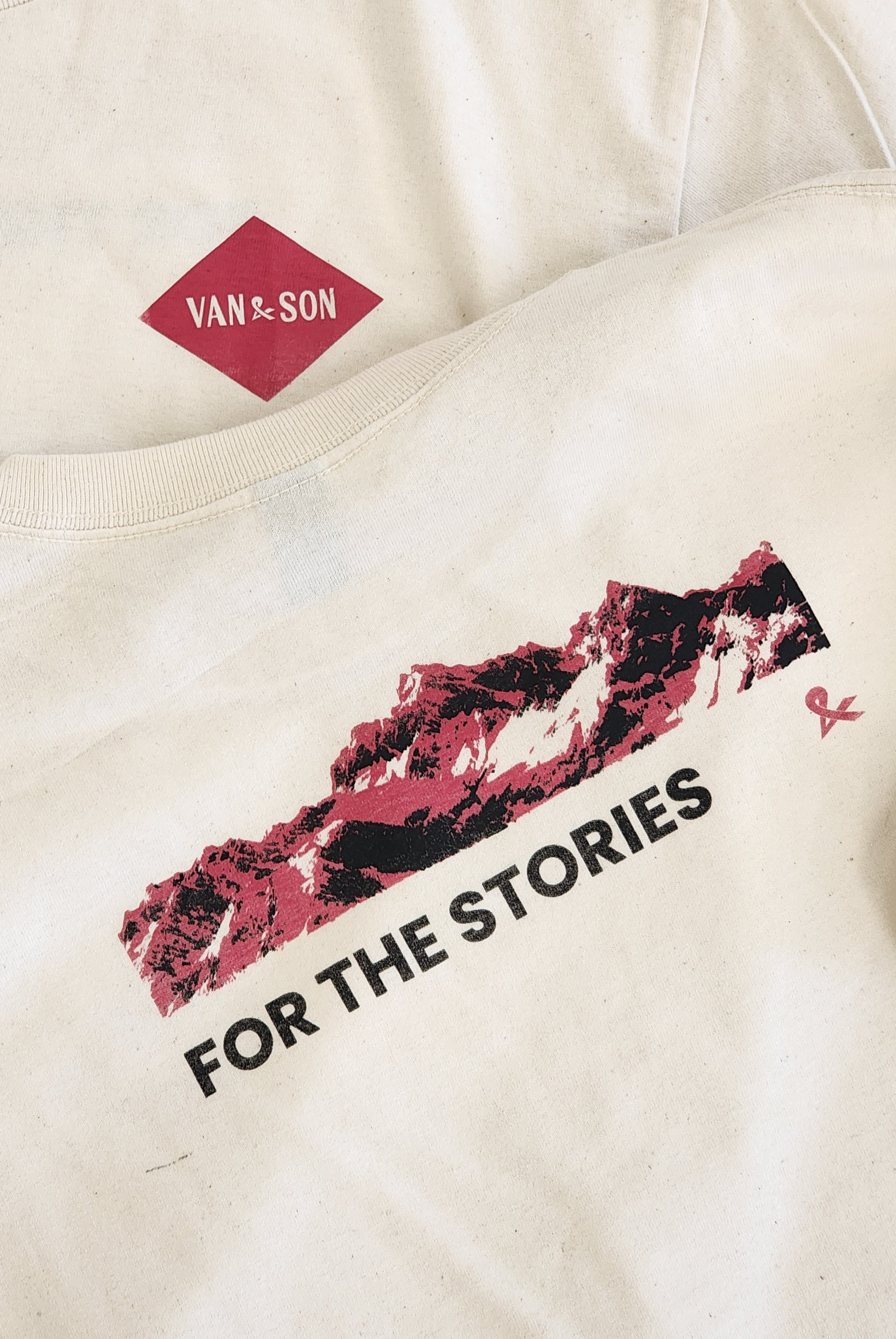
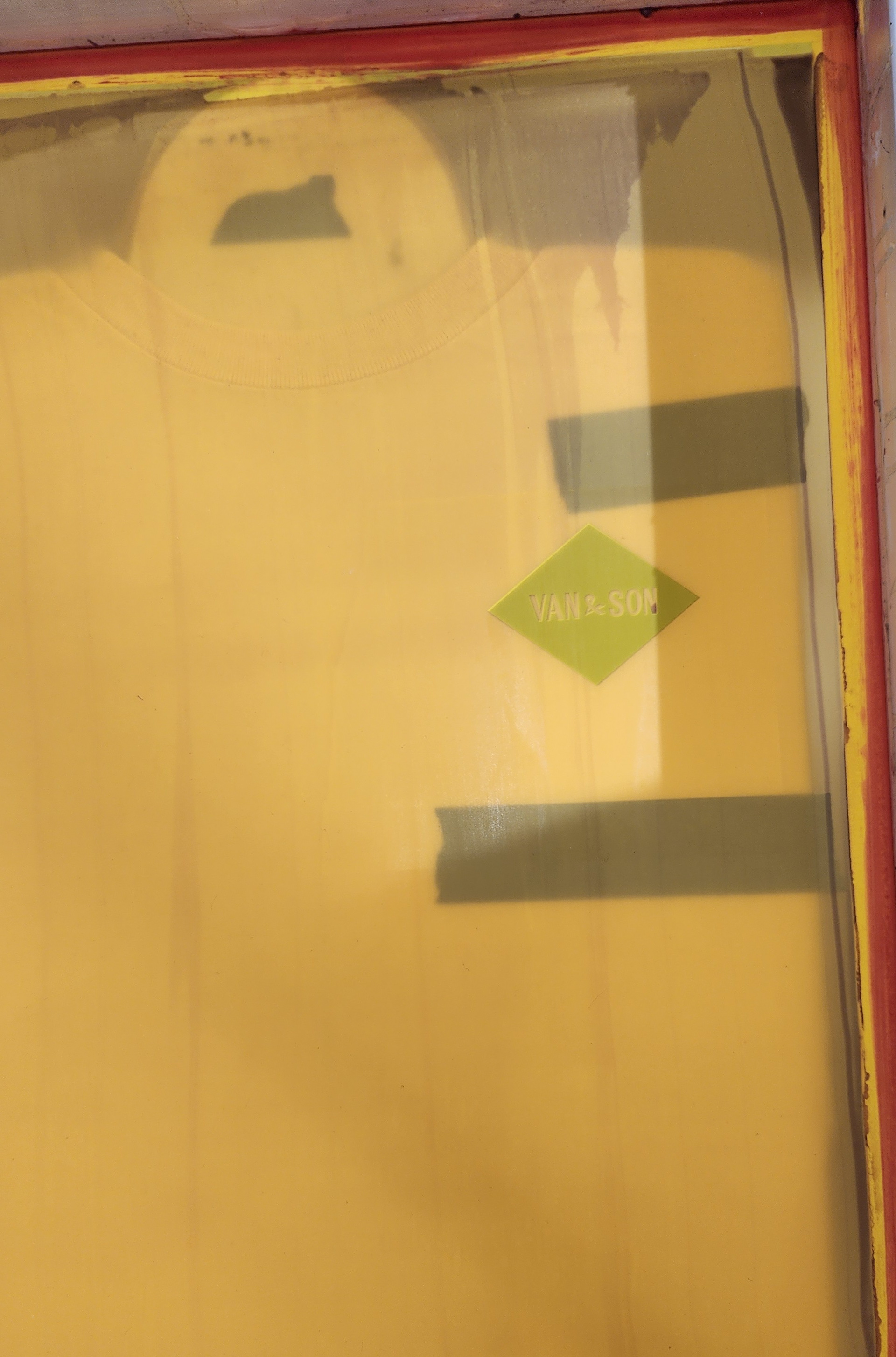
Van & Son is a unique brand specializing in premium outdoor wool clothing, designed for adventurers and hardworking individuals who embrace challenges and seek to explore and travel "for the stories."
PROBLEM
Van & Son originated from selling excess wool, but found the benefits of creating clothing for new adventures. The problem of brand identity originated, where combining their heritage
CREDITS
Designed in Adobe Creative Cloud
- Illustrator, InDesign, Photoshop
- Sketchup
YEAR
Fall of 2024
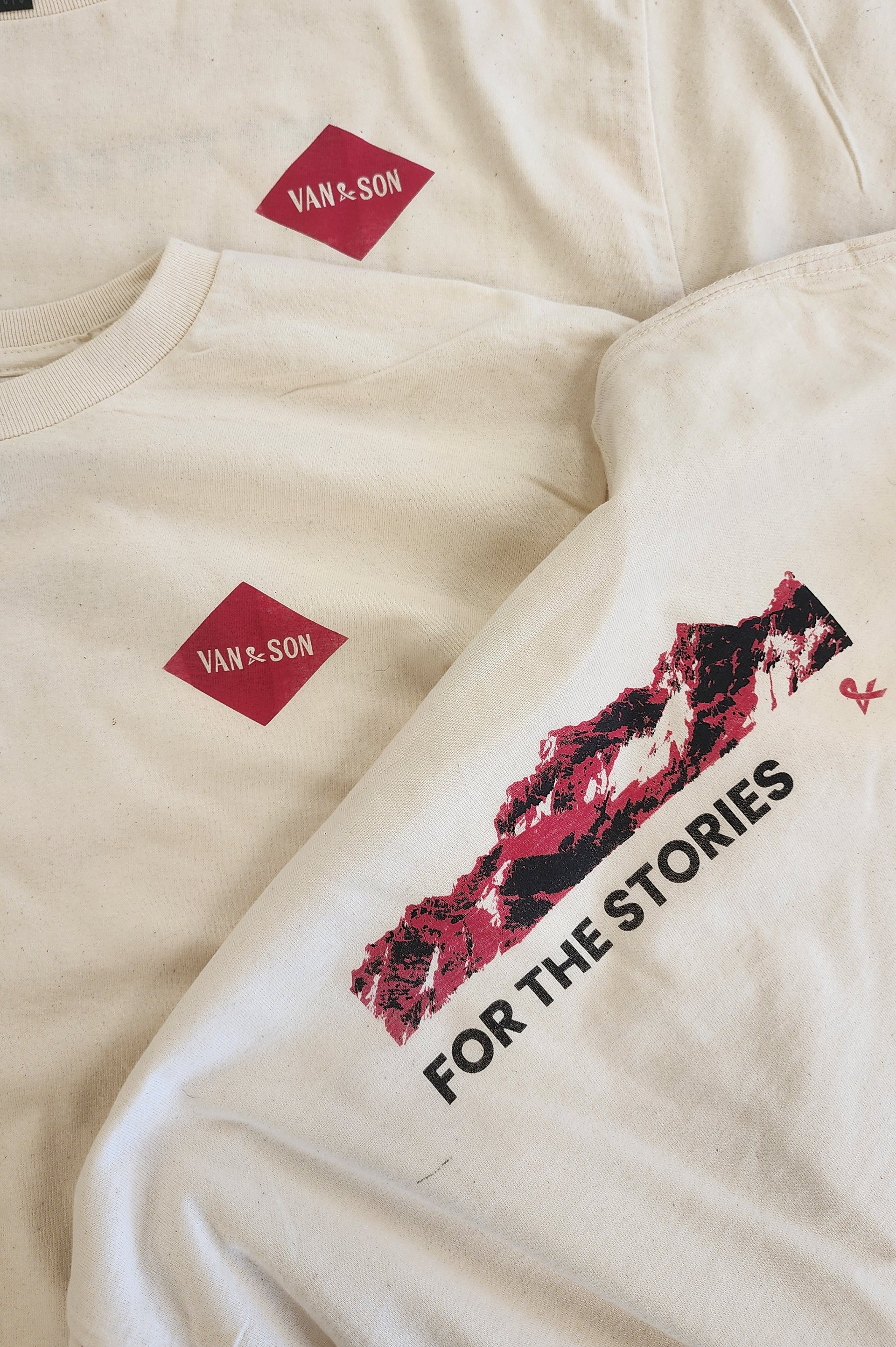
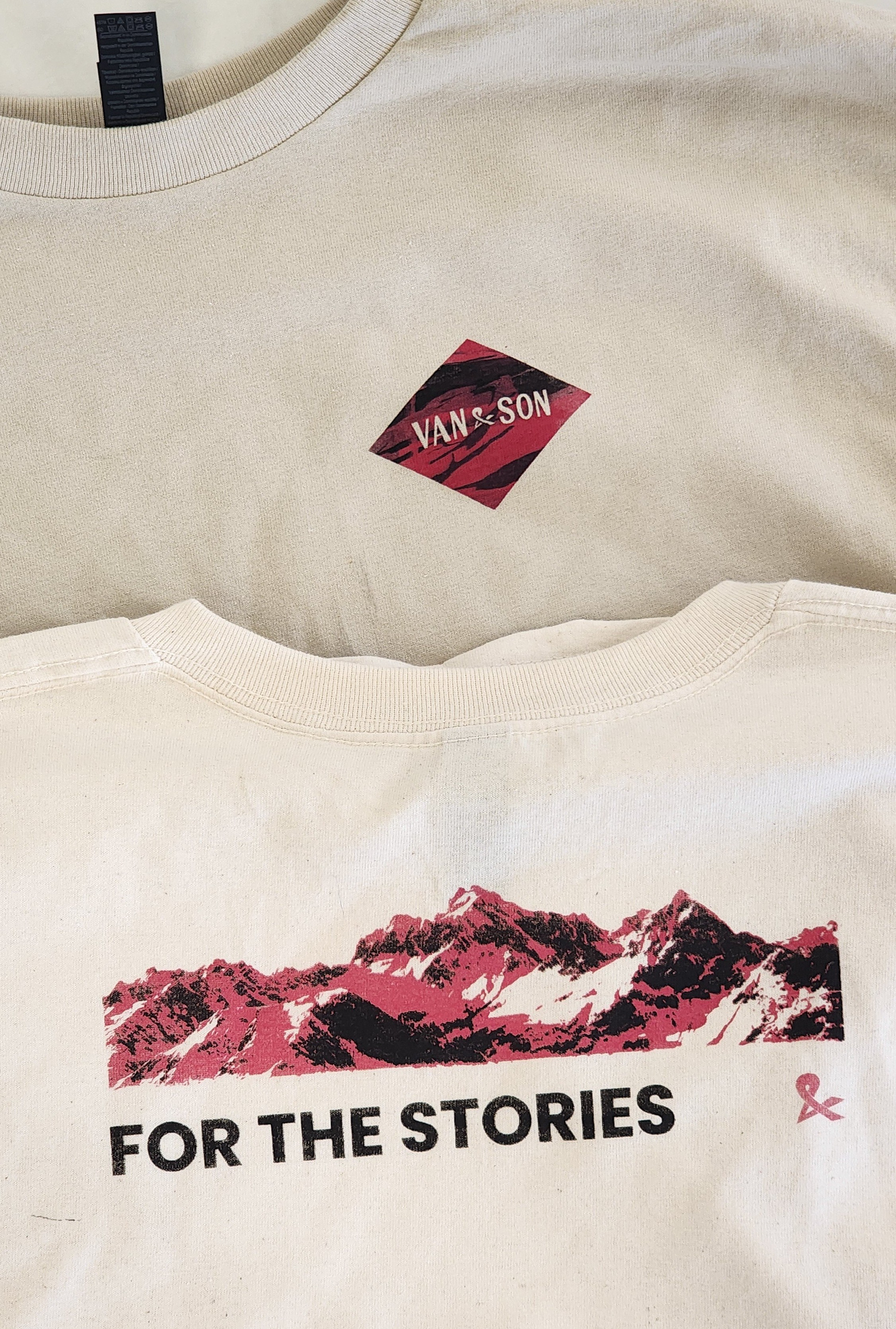
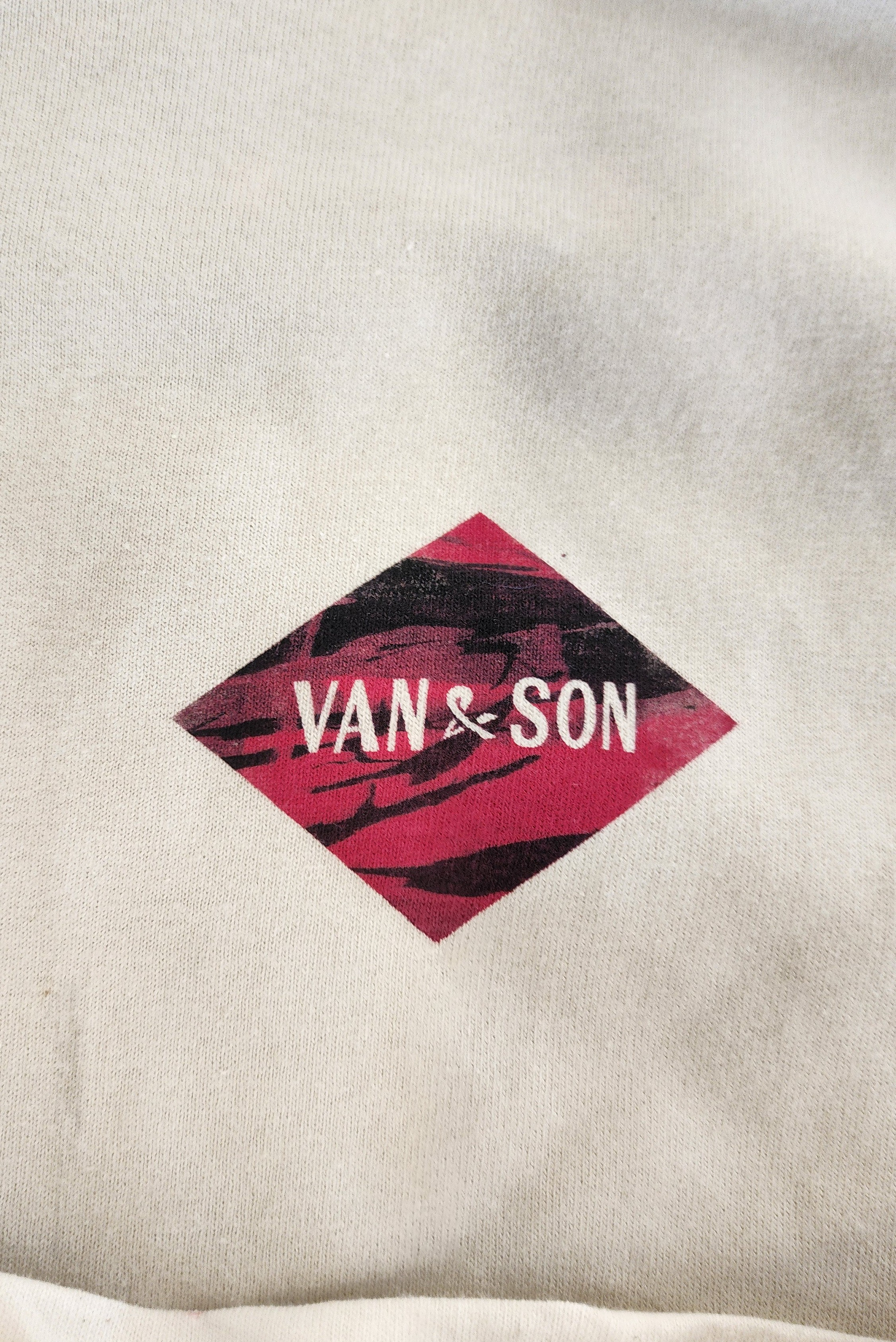
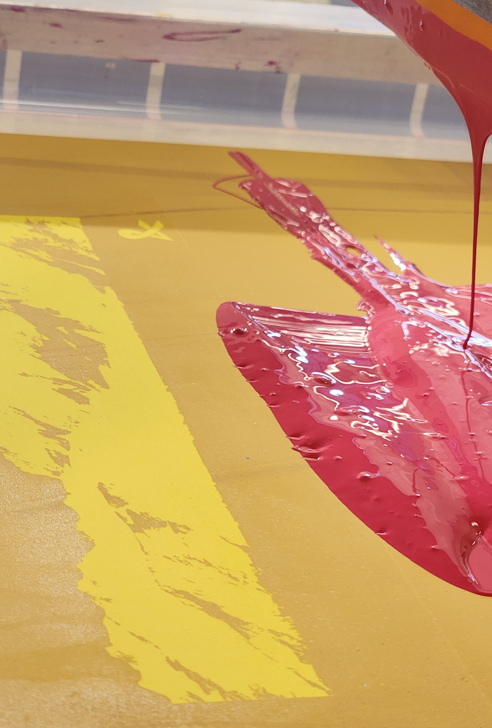
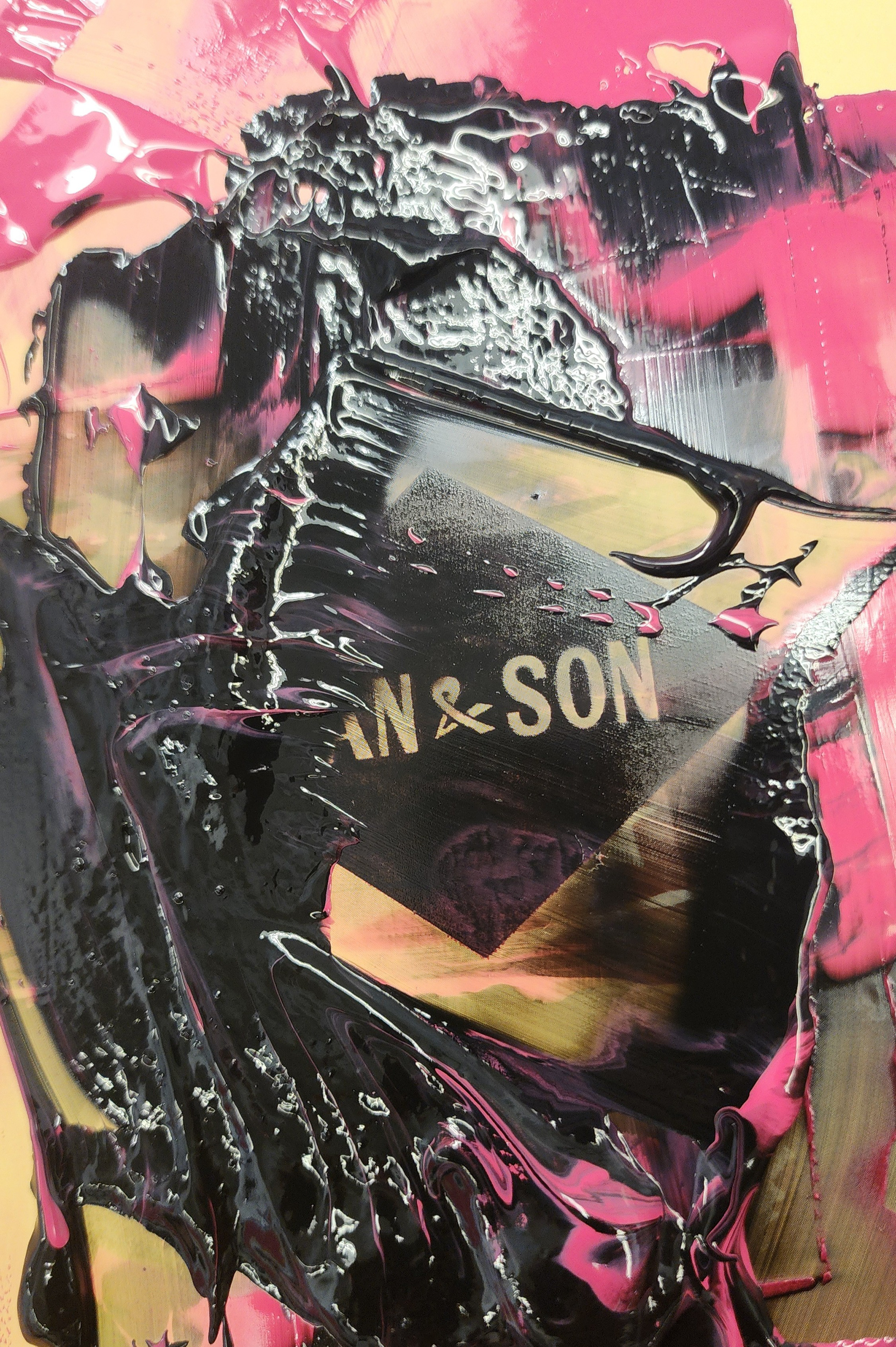
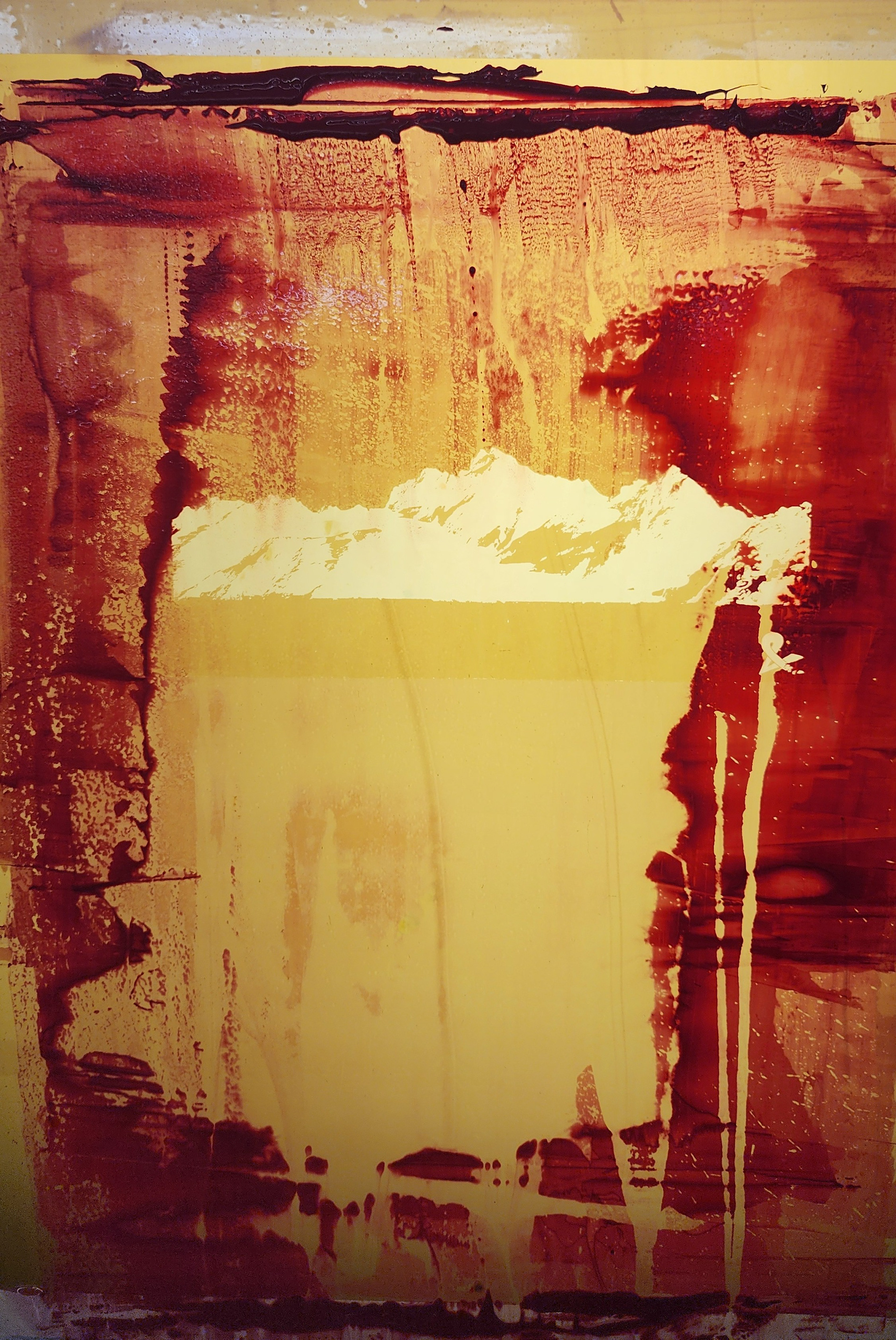
Product Concepts to Print
To prove that a digital design can successfully become a physical product, I took the Van & Son asset and transformed it into a textile piece. In Communication Design and Screen Printing, my main goal was to take something created on a screen and make it feel more human, tactile, and intentional.
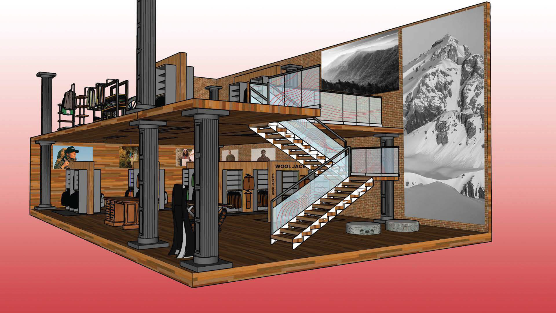
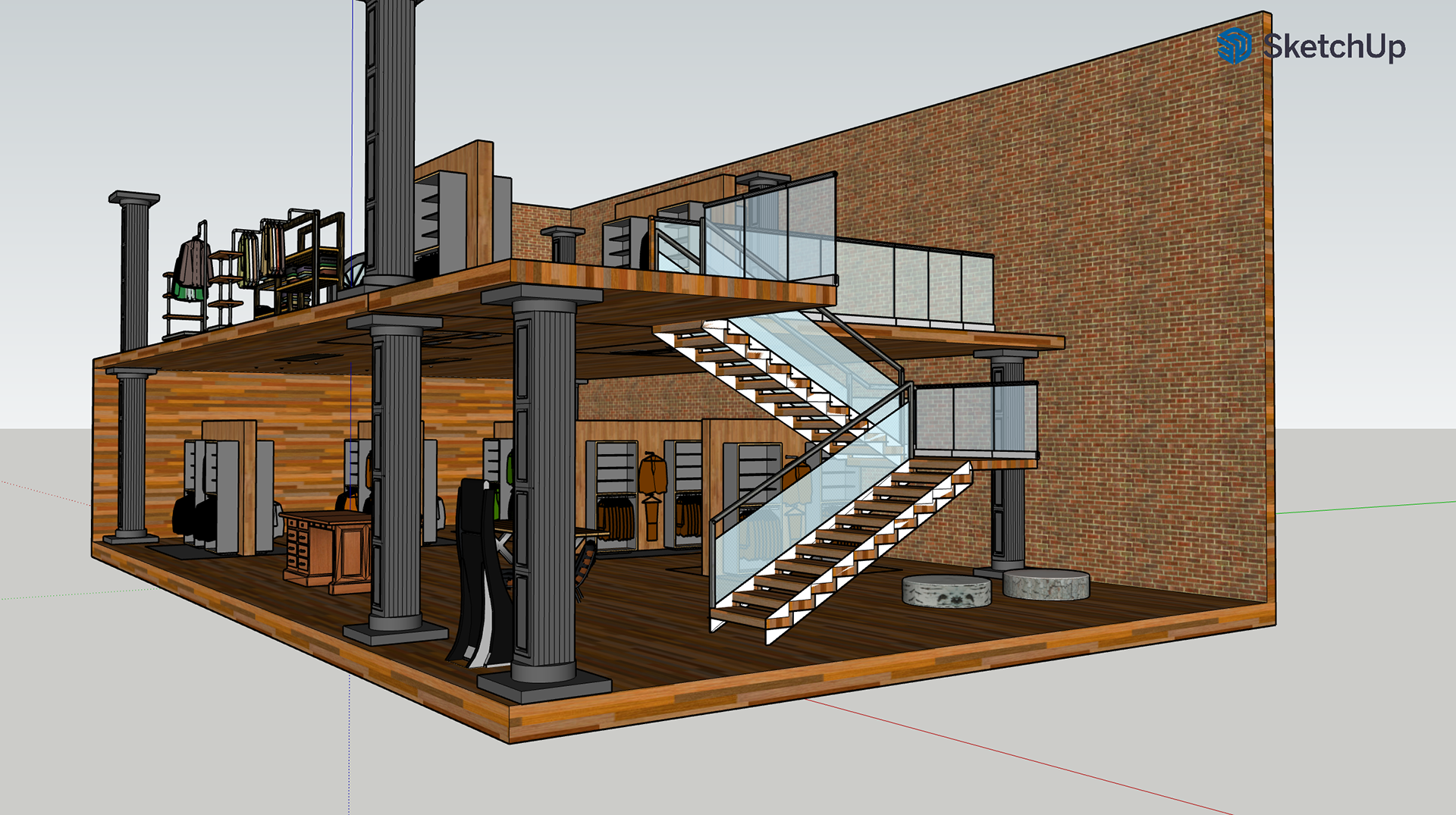
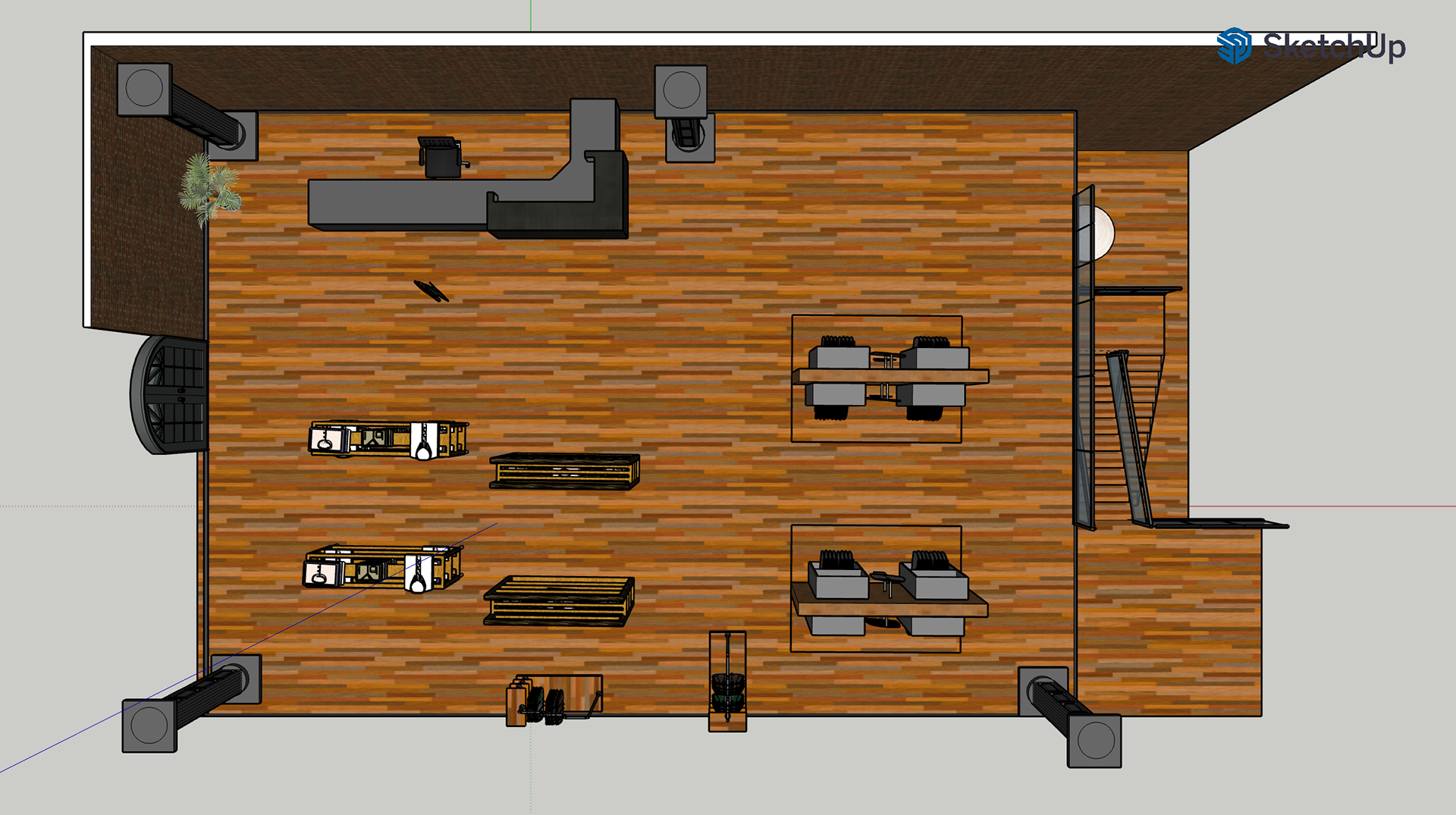
INTERIOR DESIGN PROCESS
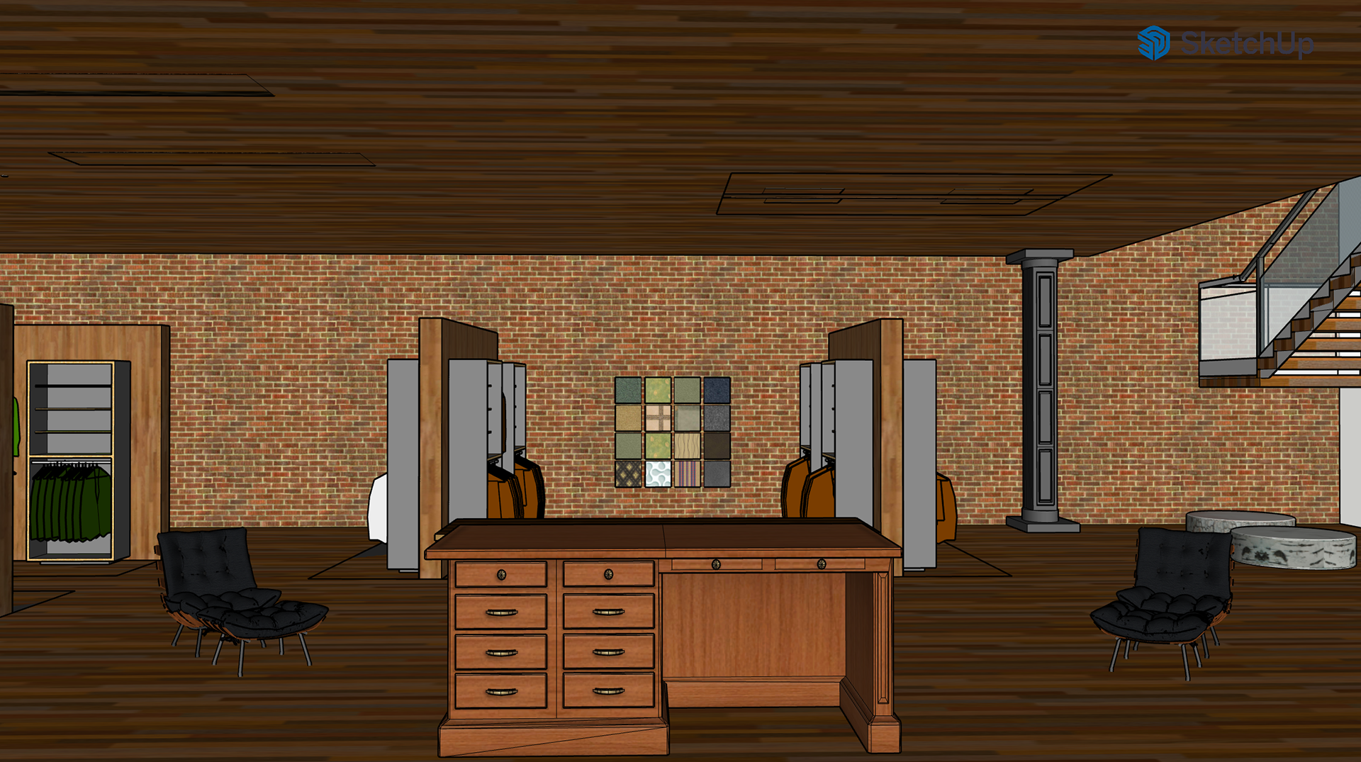
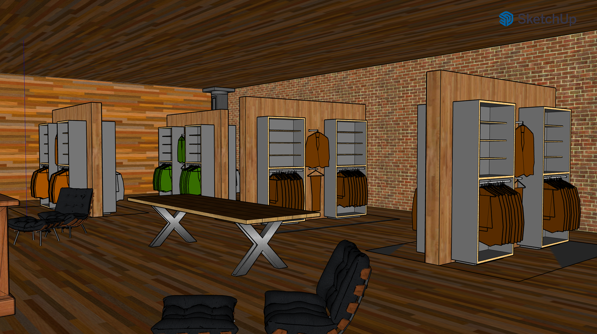
My goal for this interior concept was to blend an authentic, rustic outdoor aesthetic with modern refinement. The main floor is designed to offer the essential gear and necessities for any adventure, creating a welcoming starting point for clients who seek stories through exploration. Van & Son aims to elevate the outdoor experience through thoughtful, tailored design.
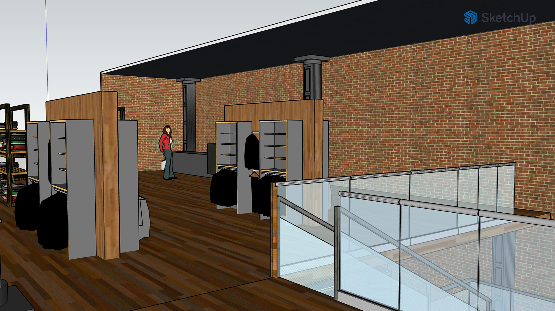
The lower level provides a more immersive environment focused on premium apparel. A dedicated fabric wall allows clients to physically explore materials, helping them choose clothing that enhances their time outdoors.
This 3D model was created in SketchUp and refined in Photoshop to add additional visual detail and atmosphere.
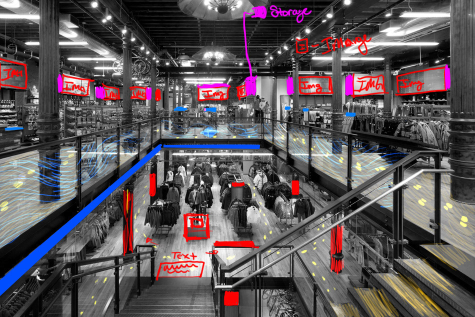
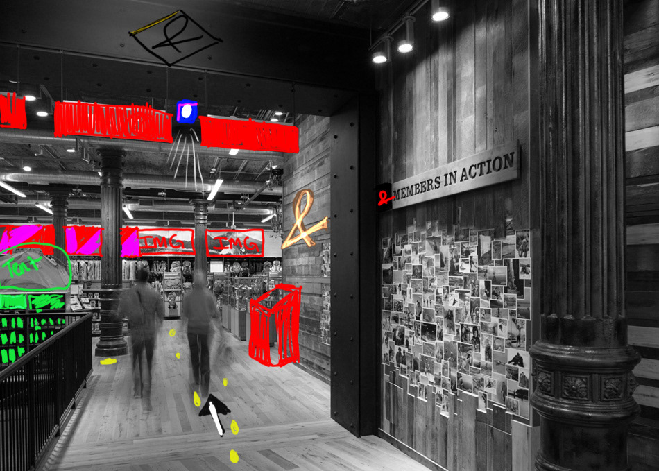
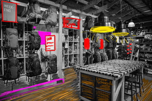
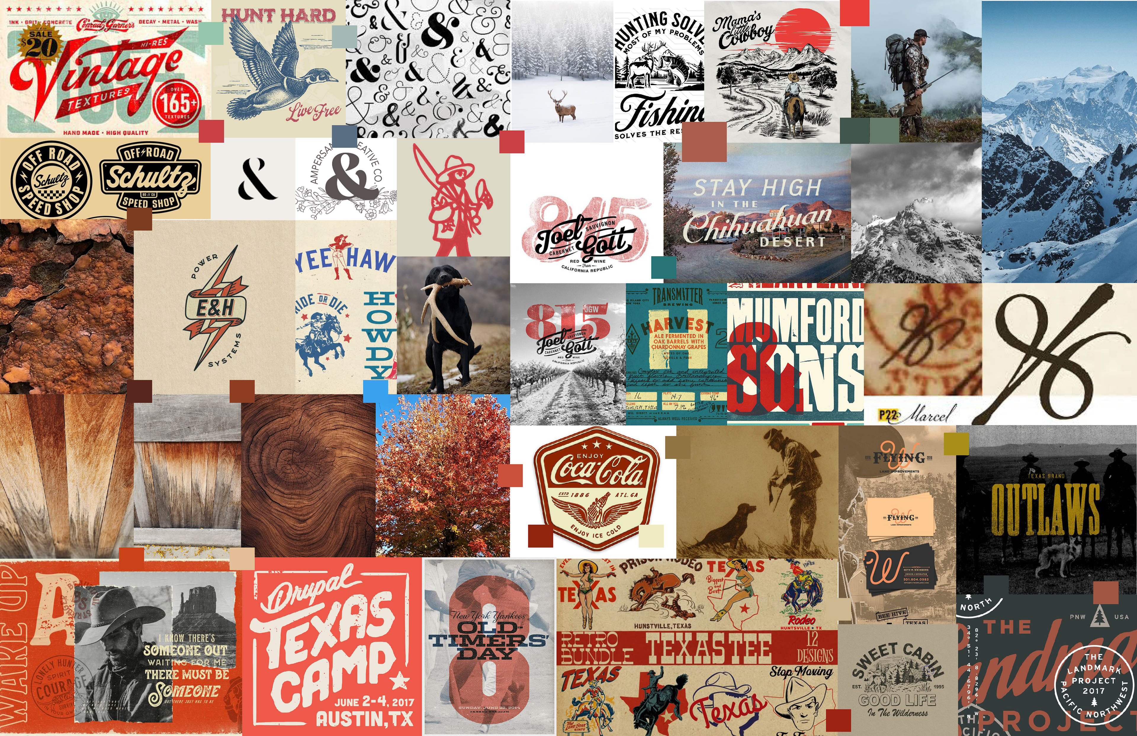
INPIRATIONAL IMAGES
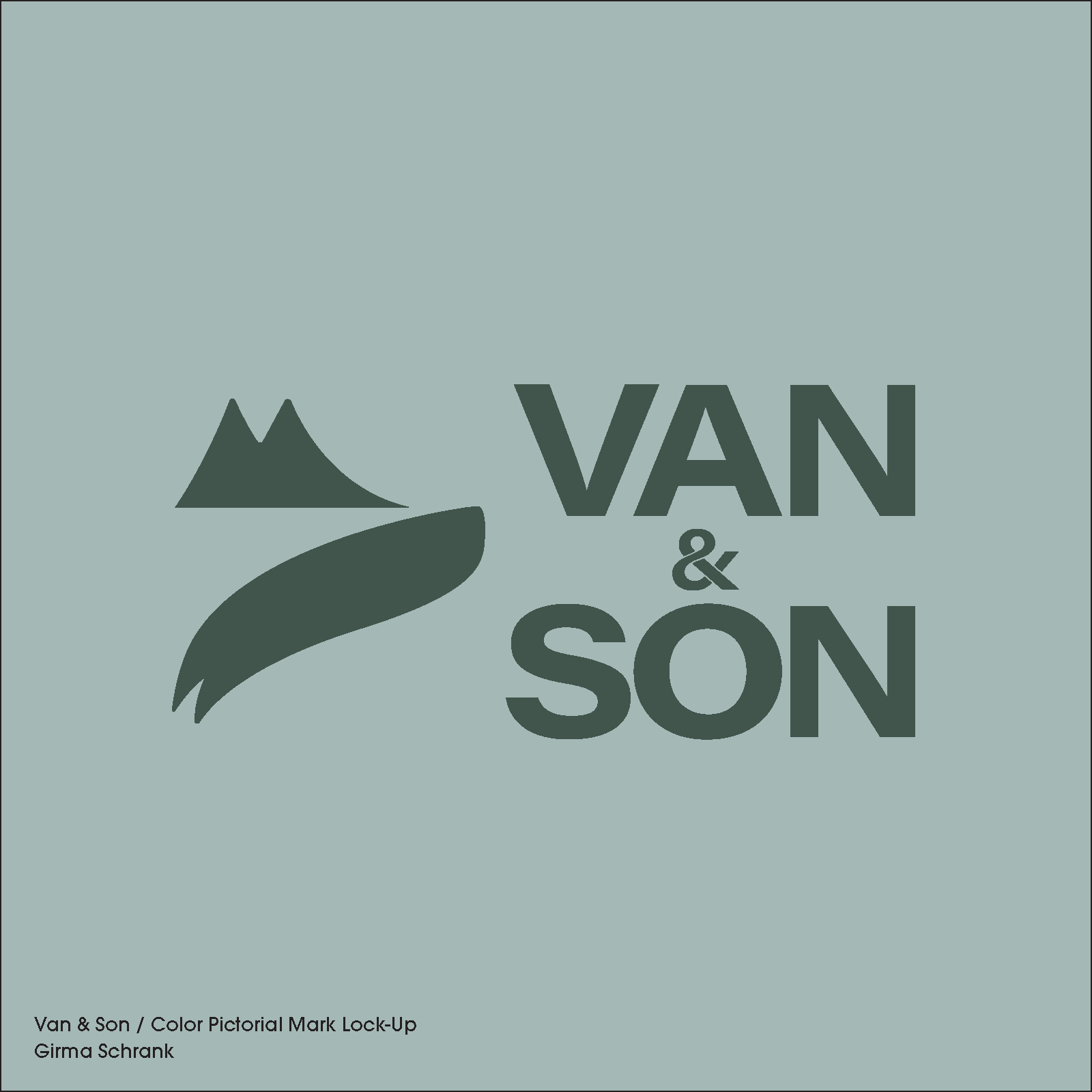
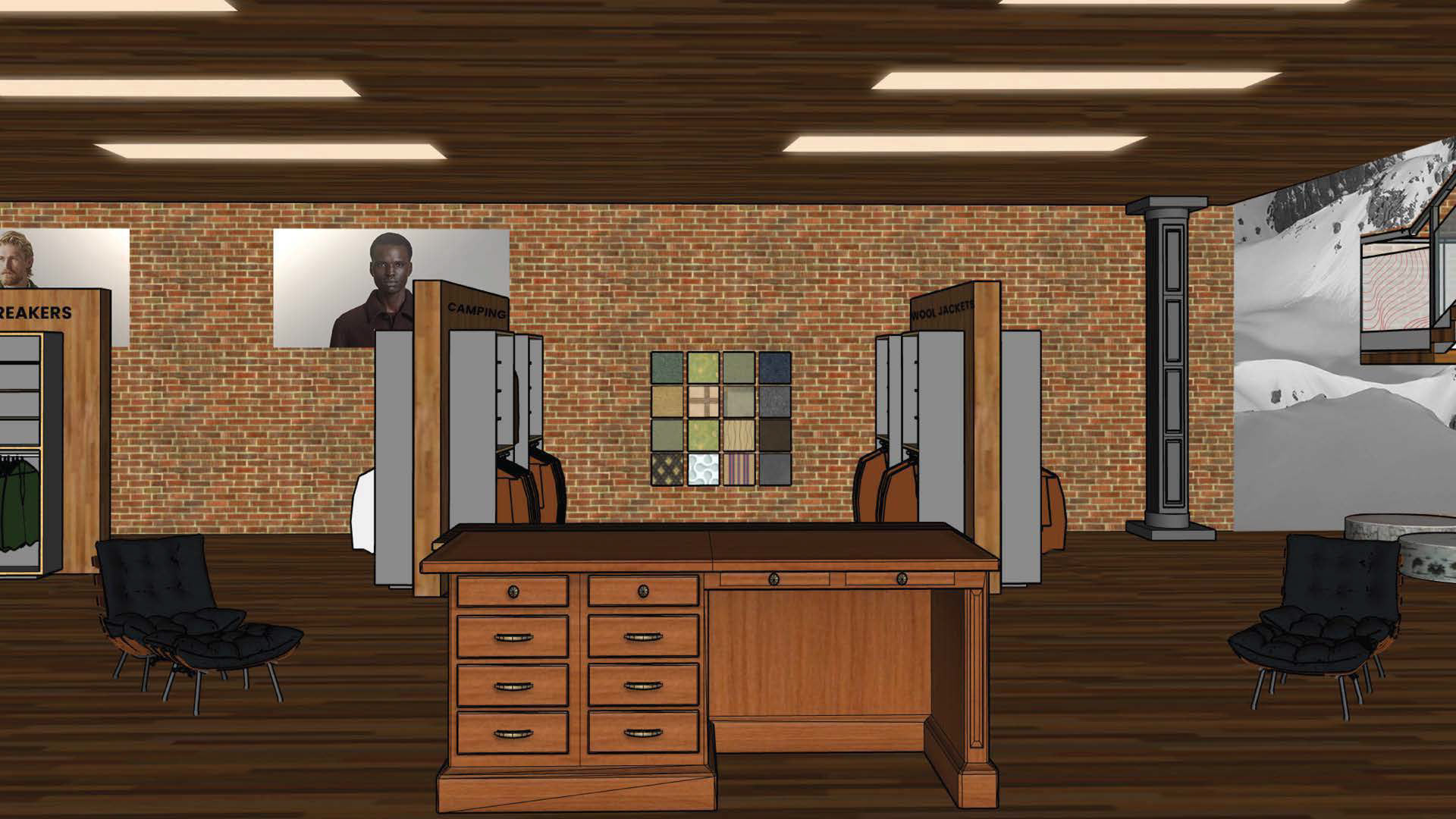
These reference images guided the development of my 3D model. The pillars share similar characteristics to Image 2, which helped define the architectural feel of the space. I envisioned a small kiosk that would guide adventurers through a brief “expedition,” marked by subtle sheep hoof prints—a tribute to the founders, who originally harvested wool from a small sheep farm.
The first image helped me determine the placement of large visuals positioned high above the floor. These images act as silent guides for shoppers—for example, a woman hiking or close-ups of warm knitwear—providing visual cues that communicate the store’s offerings. To further support clarity and reduce any uncertainty, I incorporated bold product labels to help confirm what customers are seeing as they explore the space.
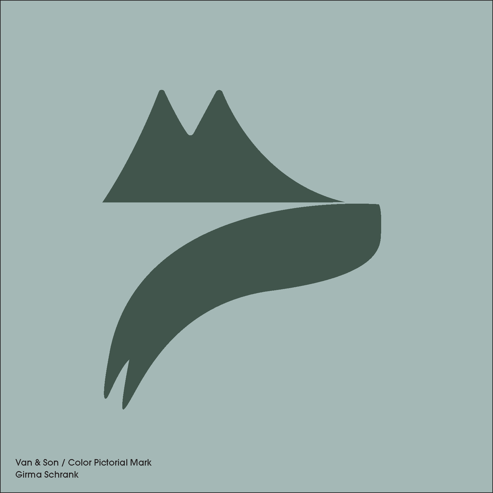
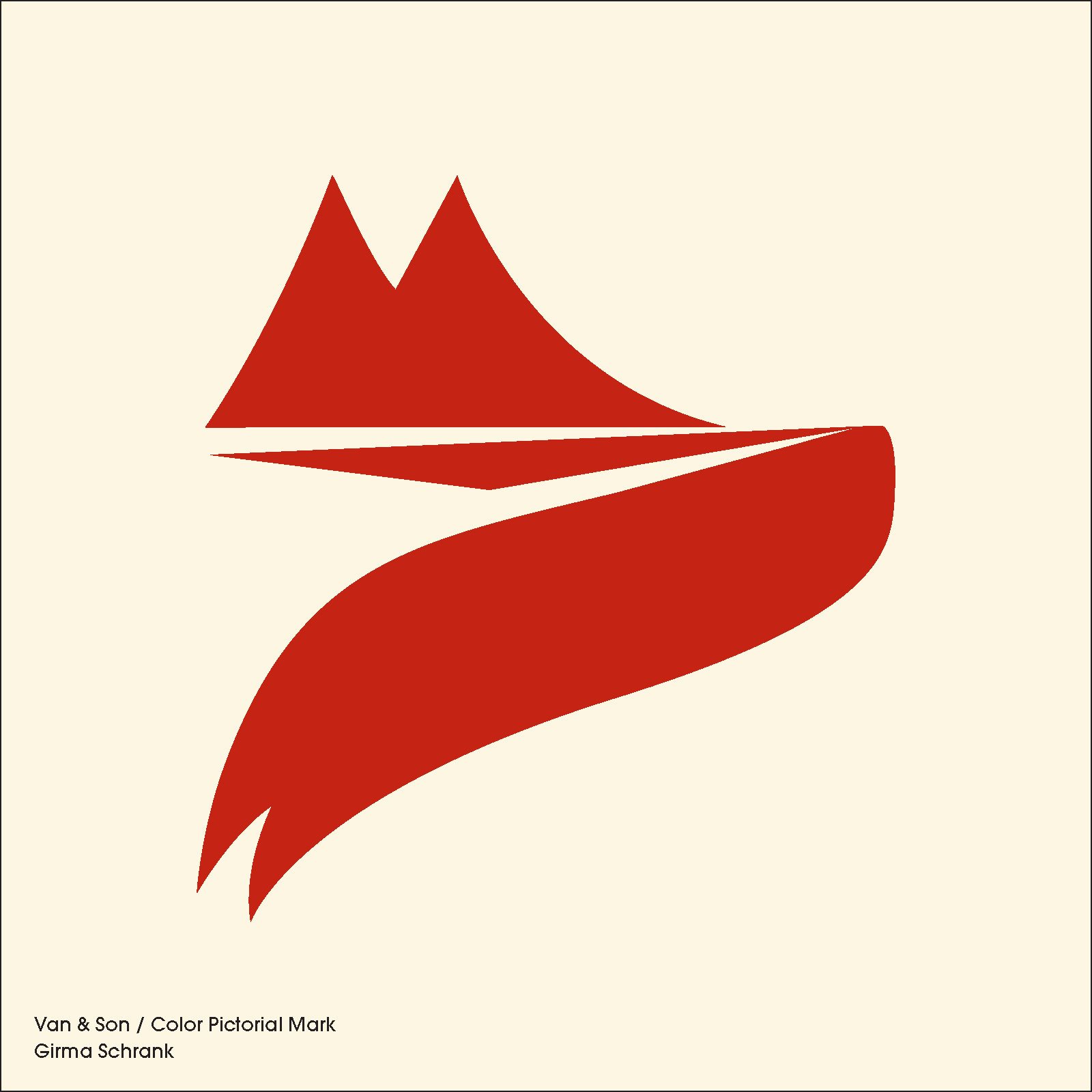
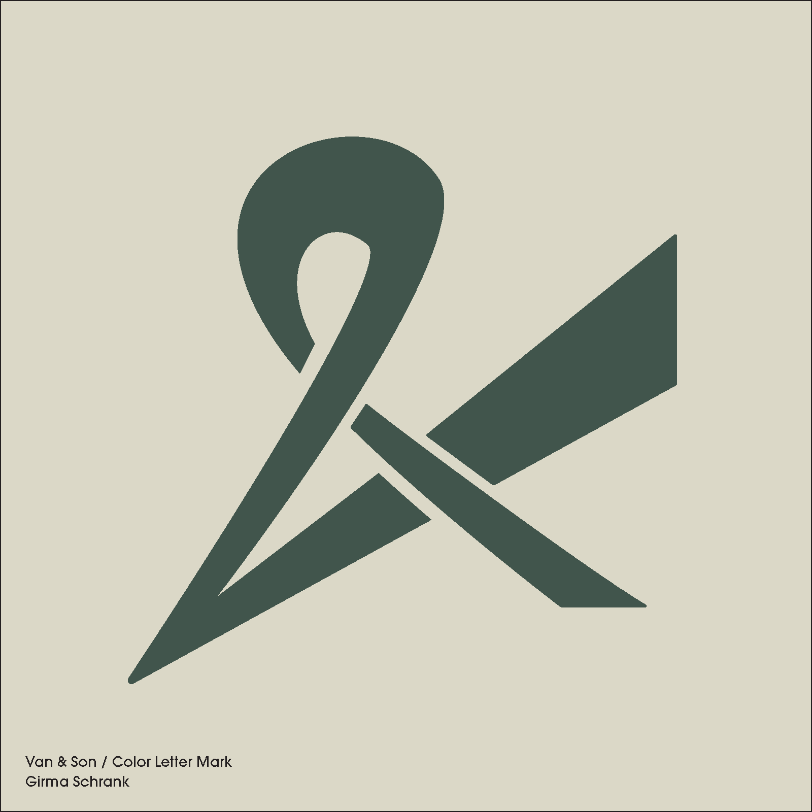
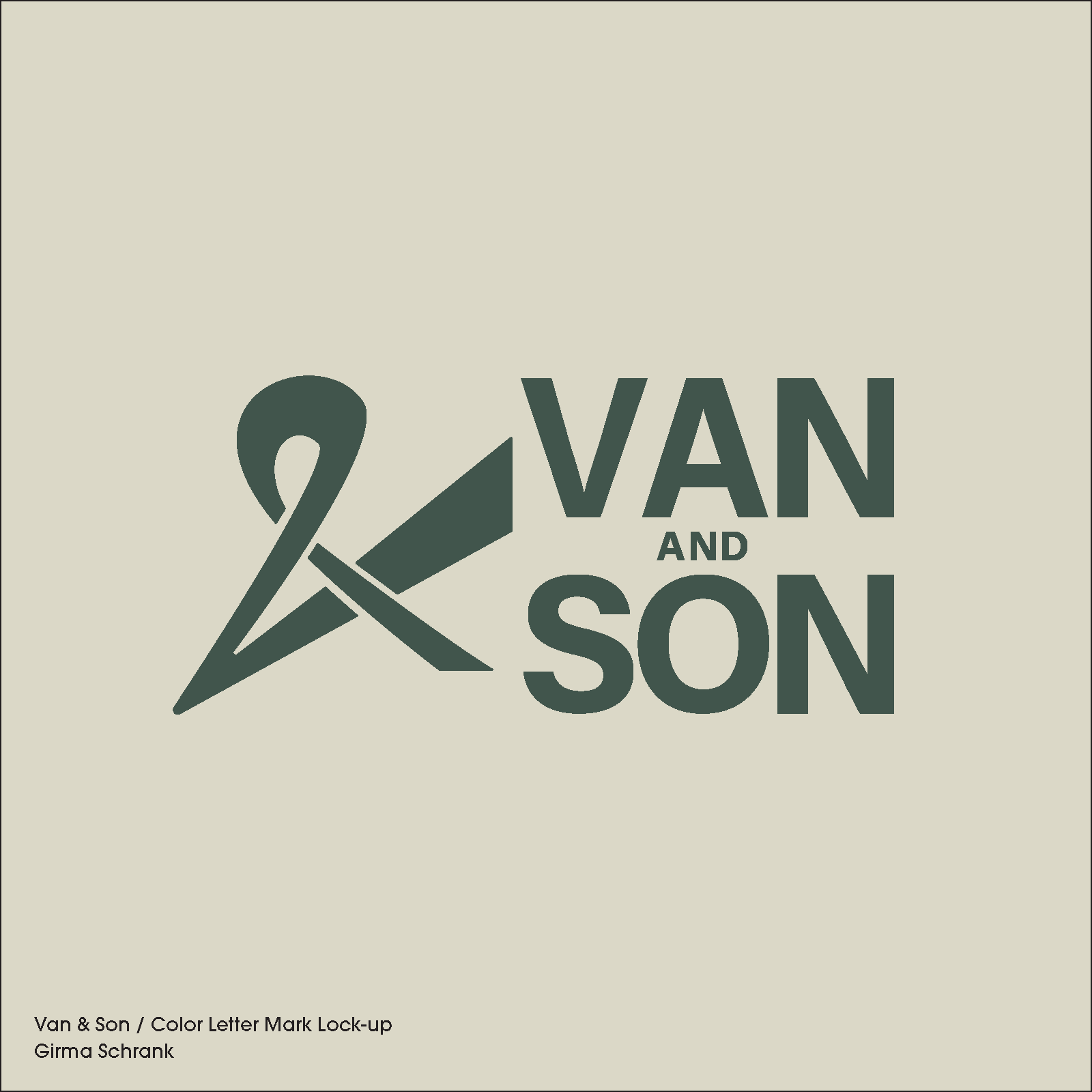
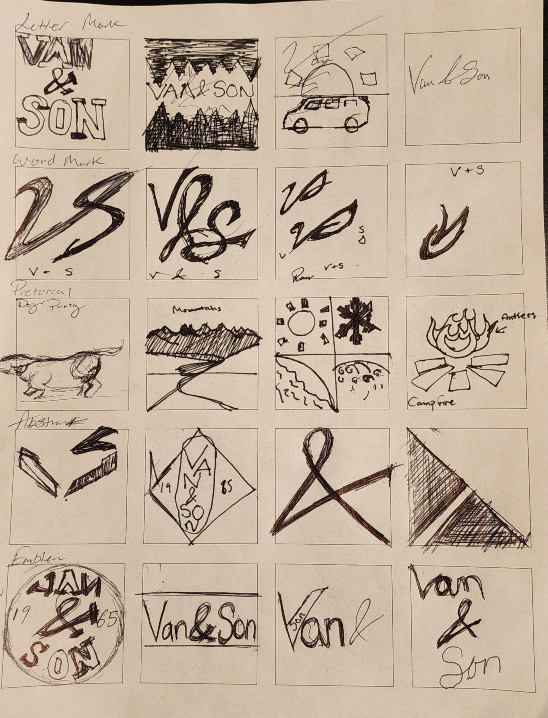
Logo Sketches
While sketching my marks, I explored ways to incorporate elements of the outdoors—animals, landscapes, and natural forms. During the process, I noticed that the ampersand resembled a pair of shears, a connection that was later confirmed through critique. The earlier wordmarks felt too heavy and attention-seeking, so I refined them by making the strokes thinner and consistent in weight. I also drew inspiration from the mood board, introducing subtle tapering to create a more balanced and intentional look.
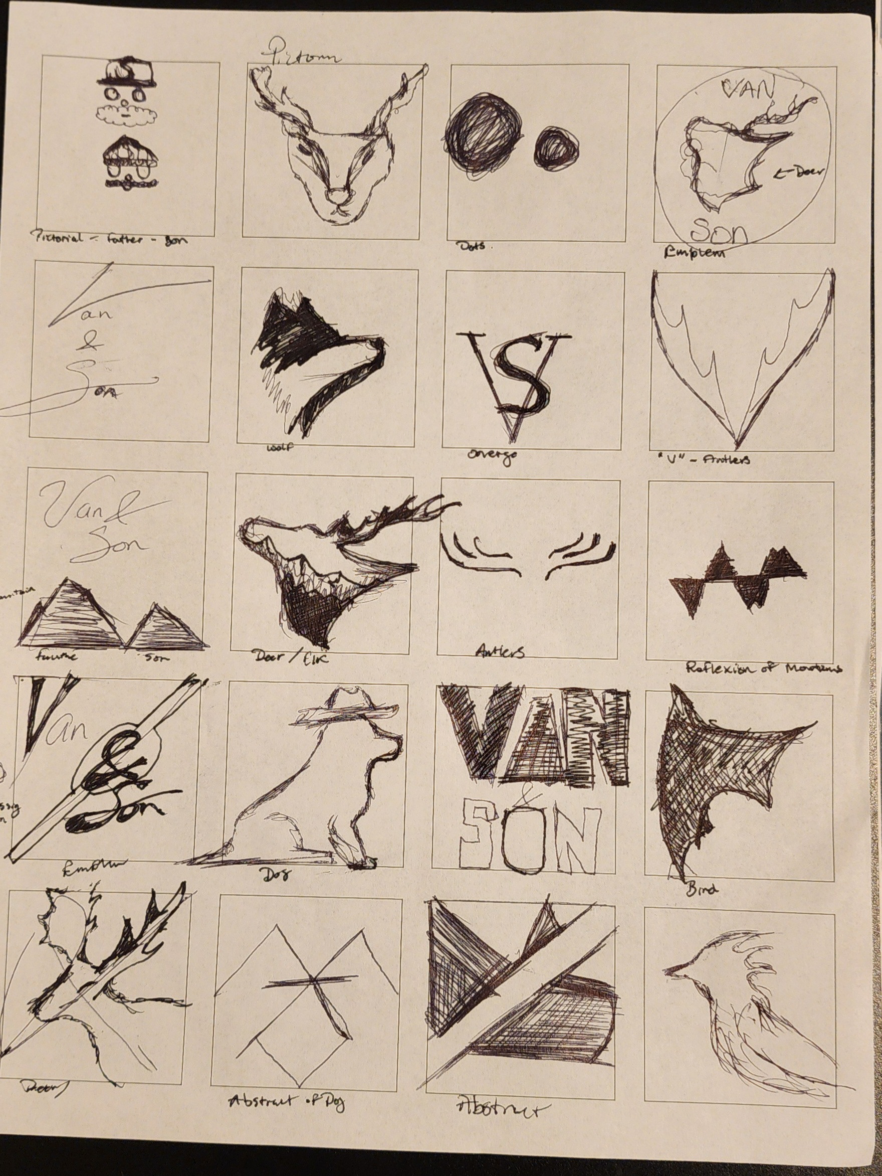
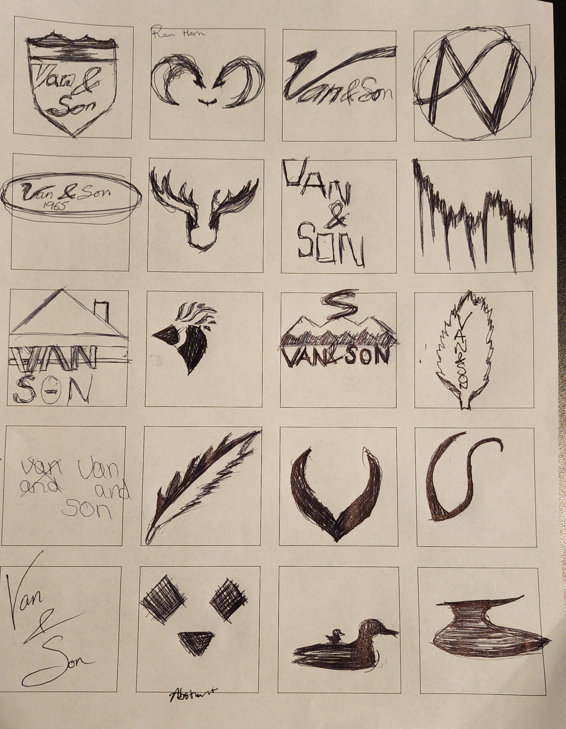
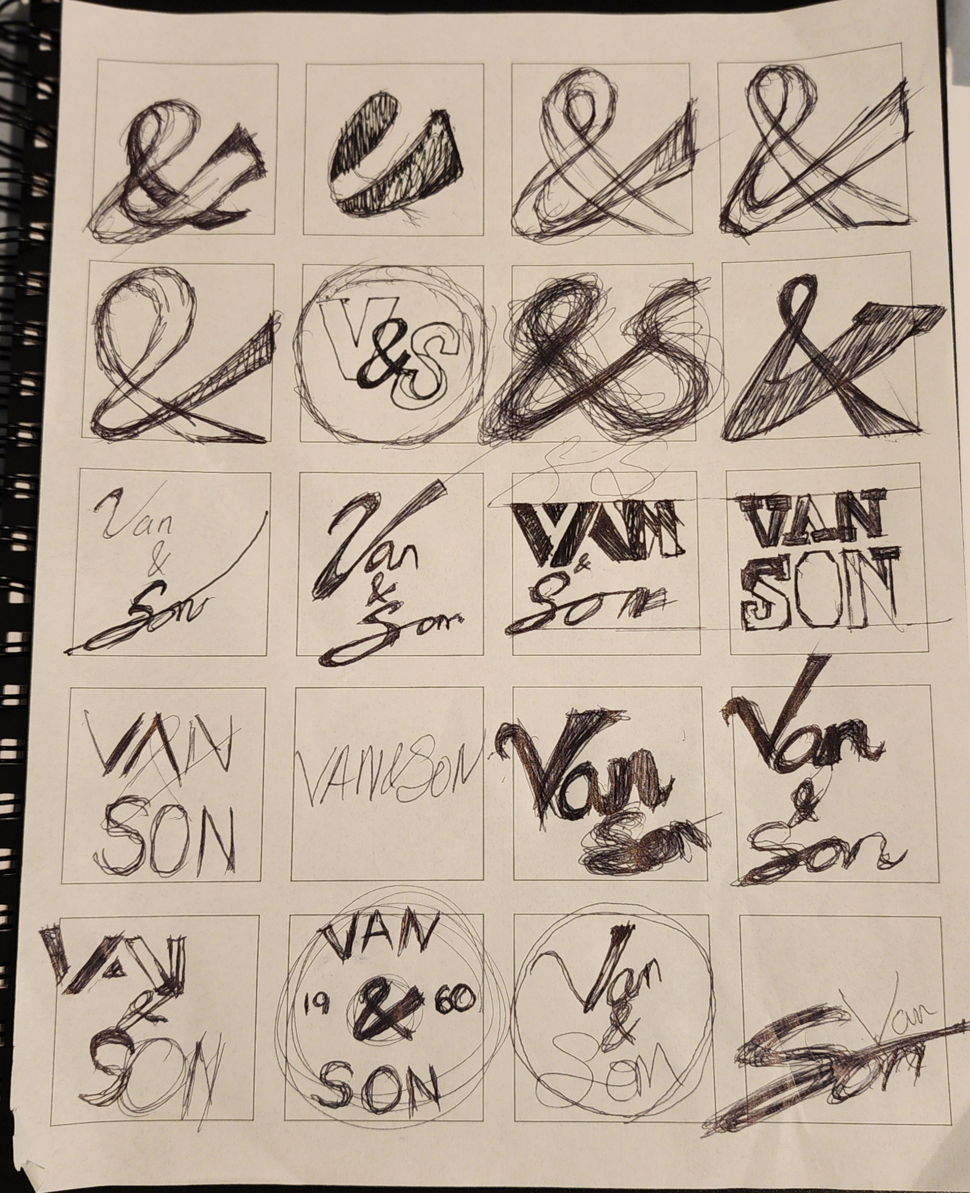
Additional marks that were not selected for the final direction.